Question
What is the contribution of wind and solar power in absolute terms in the electricity generation?
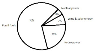
a.
6.79 GW
b.
19.4 GW
c.
9.7 GW
d.
29.1 GW
Posted under UGC NET general paper Data Interpretation
Engage with the Community - Add Your Comment
Confused About the Answer? Ask for Details Here.
Know the Explanation? Add it Here.
Q. The total electricity generation in a country is 97 GW. The contribution of various energy sources is indicated in percentage terms in the Pie Chart given below. What is the...
Similar Questions
Discover Related MCQs
Q. The total electricity generation in a country is 97 GW. The contribution of various energy sources is indicated in percentage terms in the Pie Chart given below.
What is the contribution of renewable energy sources in absolute terms in the electricity generation?
View solution
Q. The total CO2 emissions from various sectors are 5 mmt. In the Pie Chart given below, the percentage contribution to CO2 emissions from various sectors is indicated.
What is the absolute CO2 emission from domestic sector?
View solution
Q. The total CO2 emissions from various sectors are 5 mmt. In the Pie Chart given below, the percentage contribution to CO2 emissions from various sectors is indicated.
What is the absolute CO2 emission for combined thermal power and transport sectors?
View solution
Q. The following question is based upon the below diagram in which there are three interlocking circles A, P and S where A stands for Artists, circle P for Professors and circle S for Sports persons.
Different regions in the figure are lettered from a to f:
The region which represents artists who are neither sportsmen nor professors.
View solution
Q. The following question is based upon the below diagram in which there are three interlocking circles A, P and S where A stands for Artists, circle P for Professors and circle S for Sports persons.
Different regions in the figure are lettered from a to f:
The region which represents professors, who are both artists and sportspersons.
View solution
Q. The following question is based upon the below diagram in which there are three interlocking circles A, P and S where A stands for Artists, circle P for Professors and circle S for Sports persons.
Different regions in the figure are lettered from a to f:
The region which represents professors, who are also sportspersons, but not artists.
View solution
Q. The below question is based on the following data:
Measurements of some variable X were made at an interval of 1 minute from 10 A.M. to 10:20 A.M. The data, thus, obtained is as follows:
X :60, 62, 65, 64, 63, 61, 66, 65, 70, 68, 63, 62, 64, 69, 65, 64, 66, 67, 66, 64
The value of X, which is exceeded 10% of the time in the duration of measurement, is
View solution
Q. The below question is based on the following data:
Measurements of some variable X were made at an interval of 1 minute from 10 A.M. to 10:20 A.M. The data, thus, obtained is as follows:
X :60, 62, 65, 64, 63, 61, 66, 65, 70, 68, 63, 62, 64, 69, 65, 64, 66, 67, 66, 64
The value of X, which is exceeded 90% of the time in the duration of measurement, is
View solution
Q. The below question is based on the following data:
Measurements of some variable X were made at an interval of 1 minute from 10 A.M. to 10:20 A.M. The data, thus, obtained is as follows:
X :60, 62, 65, 64, 63, 61, 66, 65, 70, 68, 63, 62, 64, 69, 65, 64, 66, 67, 66, 64
The value of X, which is exceeded 50% of the time in the duration of measurement, is
View solution
Q. The following table presents the production of electronic items (TVs and LCDs) in a factory during the period from 2006 to 2010. Study the table carefully and answer the question below:
In which year, the total production of electronic items is maximum?
View solution
Q. The following table presents the production of electronic items (TVs and LCDs) in a factory during the period from 2006 to 2010. Study the table carefully and answer the question below:
What is the difference between averages of production of LCDs and TVs from 2006 to 2008 ?
View solution
Q. The following table presents the production of electronic items (TVs and LCDs) in a factory during the period from 2006 to 2010. Study the table carefully and answer the question below:
What is the year in which production of TVs is half the production of LCDs in the year 2010 ?
View solution
Q. The following table presents the production of electronic items (TVs and LCDs) in a factory during the period from 2006 to 2010. Study the table carefully and answer the question below:
What is the ratio of production of LCDs in the years 2008 and 2010 ?
View solution
Q. The following table presents the production of electronic items (TVs and LCDs) in a factory during the period from 2006 to 2010. Study the table carefully and answer the question below:
What is the ratio of production of TVs in the years 2006 and 2007 ?
View solution
Q. Below question based on the following diagram in which there are three intersecting circles I, S and P where circle I stands for Indians, circle S stands for scientists and circle P for politicians. Different regions of the figure are lettered from a to g.
The region which represents non-Indian scientists who are politicians.
View solution
Q. Below question based on the following diagram in which there are three intersecting circles I, S and P where circle I stands for Indians, circle S stands for scientists and circle P for politicians. Different regions of the figure are lettered from a to g.
The region which represents politicians who are Indians as well as scientists.
View solution
Q. The population of a city is plotted as a function of time (years) in graphic form below. Which of the following inference can be drawn from above plot ?
View solution
Q. In the following chart, the price of logs is shown in per cubic metre and that of Plywood and Saw Timber in per tonnes. Study the chart and answer the following question below.
Which product shows the maximum percentage increase in price over the period?
View solution
Q. In the following chart, the price of logs is shown in per cubic metre and that of Plywood and Saw Timber in per tonnes. Study the chart and answer the following question below.
What is the maximum percentage increase in price per cubic metre of log?
View solution
Q. In the following chart, the price of logs is shown in per cubic metre and that of Plywood and Saw Timber in per tonnes. Study the chart and answer the following question below.
In which year the prices of two products increased and that of the third increased?
View solution
Suggested Topics
Are you eager to expand your knowledge beyond Data Interpretation? We've curated a selection of related categories that you might find intriguing.
Click on the categories below to discover a wealth of MCQs and enrich your understanding of Computer Science. Happy exploring!