Question
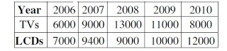
What is the difference between averages of production of LCDs and TVs from 2006 to 2008 ?
a.
3000
b.
867
c.
3015
d.
2400
Posted under UGC NET general paper Data Interpretation
Engage with the Community - Add Your Comment
Confused About the Answer? Ask for Details Here.
Know the Explanation? Add it Here.
Q. The following table presents the production of electronic items (TVs and LCDs) in a factory during the period from 2006 to 2010. Study the table carefully and answer the question...
Similar Questions
Discover Related MCQs
Q. The following table presents the production of electronic items (TVs and LCDs) in a factory during the period from 2006 to 2010. Study the table carefully and answer the question below:
What is the year in which production of TVs is half the production of LCDs in the year 2010 ?
View solution
Q. The following table presents the production of electronic items (TVs and LCDs) in a factory during the period from 2006 to 2010. Study the table carefully and answer the question below:
What is the ratio of production of LCDs in the years 2008 and 2010 ?
View solution
Q. The following table presents the production of electronic items (TVs and LCDs) in a factory during the period from 2006 to 2010. Study the table carefully and answer the question below:
What is the ratio of production of TVs in the years 2006 and 2007 ?
View solution
Q. Below question based on the following diagram in which there are three intersecting circles I, S and P where circle I stands for Indians, circle S stands for scientists and circle P for politicians. Different regions of the figure are lettered from a to g.
The region which represents non-Indian scientists who are politicians.
View solution
Q. Below question based on the following diagram in which there are three intersecting circles I, S and P where circle I stands for Indians, circle S stands for scientists and circle P for politicians. Different regions of the figure are lettered from a to g.
The region which represents politicians who are Indians as well as scientists.
View solution
Q. The population of a city is plotted as a function of time (years) in graphic form below. Which of the following inference can be drawn from above plot ?
View solution
Q. In the following chart, the price of logs is shown in per cubic metre and that of Plywood and Saw Timber in per tonnes. Study the chart and answer the following question below.
Which product shows the maximum percentage increase in price over the period?
View solution
Q. In the following chart, the price of logs is shown in per cubic metre and that of Plywood and Saw Timber in per tonnes. Study the chart and answer the following question below.
What is the maximum percentage increase in price per cubic metre of log?
View solution
Q. In the following chart, the price of logs is shown in per cubic metre and that of Plywood and Saw Timber in per tonnes. Study the chart and answer the following question below.
In which year the prices of two products increased and that of the third increased?
View solution
Q. The following question is based on the following diagram in which there are three intersecting circles. H representing The Hindu, I representing Indian Express and T representing The Times of India. A total of 50 persons were surveyed and the number in the Venn diagram indicates the number of persons reading the newspapers.
How many persons would be reading at least two newspapers?
View solution
Q. The following question is based on the following diagram in which there are three intersecting circles. H representing The Hindu, I representing Indian Express and T representing The Times of India. A total of 50 persons were surveyed and the number in the Venn diagram indicates the number of persons reading the newspapers.
How many persons would be reading almost two newspapers?
View solution
Q. Which of the following graphs does not represent regular (periodic) behavior of the variable f(t)?
View solution
Q. Study the following graph and answer the question below:
In which year total number of patients registered in hospital X and hospital Y was the maximum?
View solution
Q. Study the following graph and answer the below question.
What is the maximum dispersion in the registration of patients in the two hospitals in a year?
View solution
Q. Study the following graph and answer the question below:
In which year there was maximum decrease in registration of patients in hospital X?
View solution
Q. Below question is based on the following Venn diagram in which there are three intersecting circles representing Hindi knowing persons, English knowing persons and persons who are working as teachers. Different regions so obtained in the figure are marked as a, b, c, d, e, f and g.
If you want to select Hindi and English knowing teachers, which of the following is to be selected?
View solution
Q. Below question is based on the following Venn diagram in which there are three intersecting circles representing Hindi knowing persons, English knowing persons and persons who are working as teachers. Different regions so obtained in the figure are marked as a, b, c, d, e, f and g.
If you want to select persons, who do not know English and are not teachers, which of the region is to be selected?
View solution
Q. Study the following graph carefully and answer question below.
In which year the quantity of engineering goods' exports was maximum?
View solution
Q. Study the following graph carefully and answer question below.
View solution
Q. Study the following graph carefully and answer question below.
In which year the quantity of exports was 100 percent higher than the quantity of previous year?
View solution
Suggested Topics
Are you eager to expand your knowledge beyond Data Interpretation? We've curated a selection of related categories that you might find intriguing.
Click on the categories below to discover a wealth of MCQs and enrich your understanding of Computer Science. Happy exploring!